this post was submitted on 27 Apr 2024
692 points (97.9% liked)
Data Is Beautiful
6474 readers
1 users here now
A place to share and discuss data visualizations. #dataviz
(under new moderation as of 2024-01, please let me know if there are any changes you want to see!)
founded 3 years ago
MODERATORS
you are viewing a single comment's thread
view the rest of the comments
view the rest of the comments
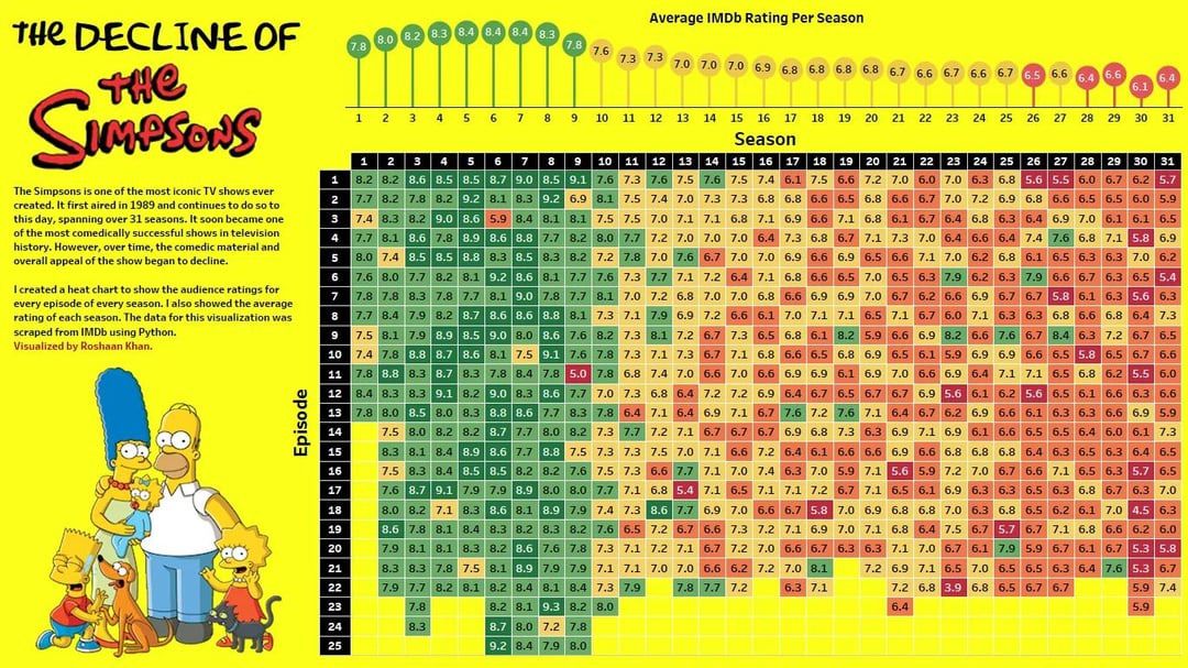
I'm just nitpicking but why are 7.7 and 6.6 arbitrary the thresholds for the colour change? Also, why is one 6.6 red while another two are yellow?
It appears that the colours are not on a fixed scale. The season averages and individual episodes are coloured using different ranges.
It ranges from lowest to highest regardless of the value. Like conditional formatting in Excel does if you don't specify the scale.
The seasons average ratings range from 6.1-8.4, so it goes red to green in the span of 2.3 points.
The episodes range from 3.9 to 9.3, so it goes red to green in the span of 5.4 points.
The full IMDb ratings range from 1-10. This should have been used as a basis for the colouring instead. The overall average on IMDb is somewhere around 7, so it would be fine to skew the colours so the middle/yellow was at 7, but it should be able to represent any possible ratings.
I think it's fair to colour seasons and episodes with different scales because they are measuring different things.
Due to the Central Limit Theorem, average of 20+ episodes will have a smaller standard deviation than individual episodes.
For example, an individual episode with a score of 6 you'll probably watch. A whole season with a score of 6, maybe not.