this post was submitted on 08 Jun 2024
928 points (99.2% liked)
Data Is Beautiful
6482 readers
1 users here now
A place to share and discuss data visualizations. #dataviz
(under new moderation as of 2024-01, please let me know if there are any changes you want to see!)
founded 3 years ago
MODERATORS
you are viewing a single comment's thread
view the rest of the comments
view the rest of the comments
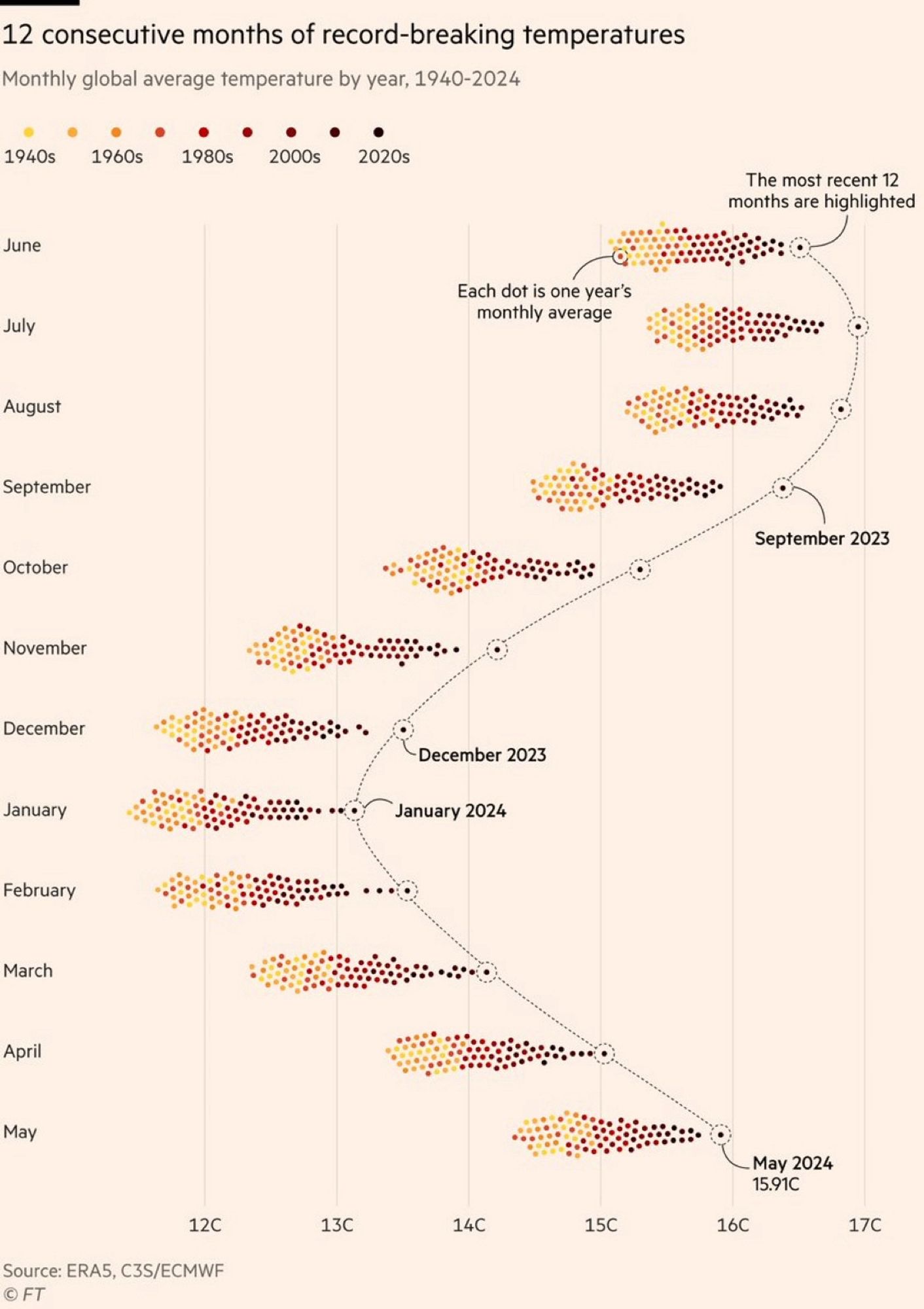
Why does it seem like this is only the northern hemisphere and not truly "global"? Shouldn't it be warm in the southern hemisphere when it's cold in the north? So shouldn't these groupings generally hover around an average between northern and southern hemisphere temps?
Because the northern hemisphere is mostly land mass and the southern hemisphere is mostly ocean. Land heats faster and cools faster than ocean, thus the seasonal effects are more pronounced in the data.
Same with CO2 patterns which gives a similar yearly 'breathing effect'