this post was submitted on 08 Jun 2024
928 points (99.2% liked)
Data Is Beautiful
6482 readers
1 users here now
A place to share and discuss data visualizations. #dataviz
(under new moderation as of 2024-01, please let me know if there are any changes you want to see!)
founded 3 years ago
MODERATORS
you are viewing a single comment's thread
view the rest of the comments
view the rest of the comments
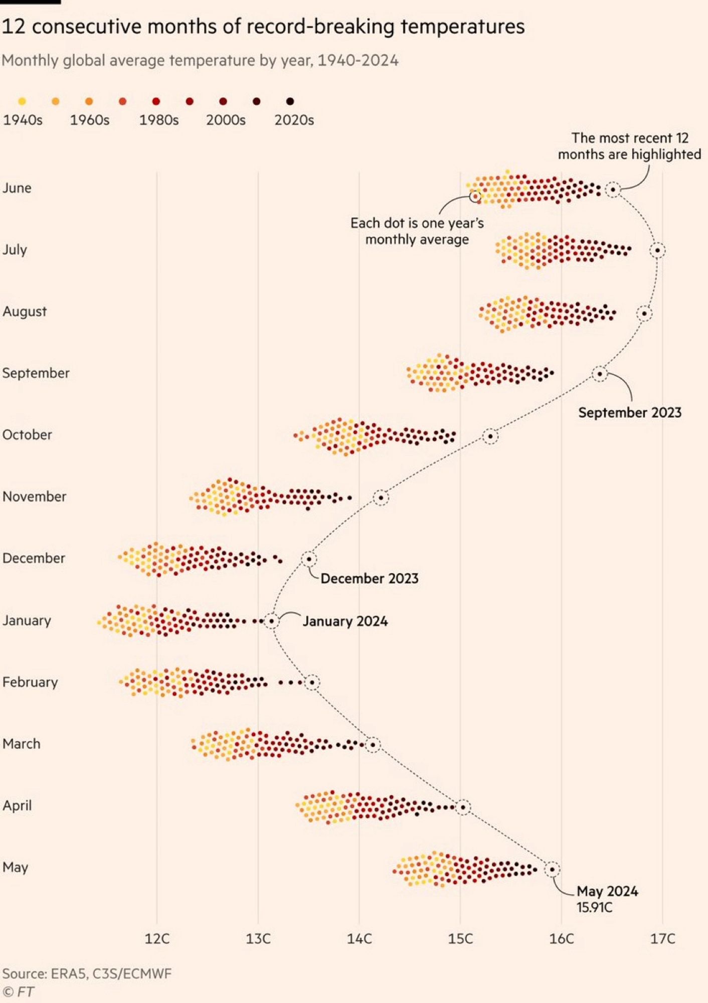
Making data beautiful is what this community is about. But compromising readability for a color scheme is just annoying. Present data first, worry about it being extra pretty second.
We're already looking at time being encoded differently than the usual horizontal axis, don't make it harder.
On the other hand, if the purpose of the graph isn't to present individual data points, but to present the monthly trends, then maybe it would have been OK, if the last 3 decades could have started over with a higher luminance set of colors. IDK but I think I would have used colors with more contrast and dropped the warm earthy theme.