I've always considered pretty good to be a positive modifier on good, making it a little better than good. Not much, but better nonetheless. I've never really understood why other people consider it to be worse than good.
Data Is Beautiful
A place to share and discuss data visualizations. #dataviz
(under new moderation as of 2024-01, please let me know if there are any changes you want to see!)
Because "pretty" as a modifier generally means that something is relatively so, but not completely.
Like if you draw a line freehand and it comes out "pretty straight", it's relatively straight but not completely straight.
If you buy something that is "pretty cheap", it's relatively cheap, but still a bit on the expensive side.
Similarly, if something is "pretty good", it's relatively good but not perfectly good.
See, I don't agree with this analysis. It works fine for your pretty straight example, but that's because Straight is already as straight as it can be. Something can't be extra straight. But if I were to say something is pretty cheap, I would actually mean that it's cheaper than I would mean if I just said it was cheap. Generally when I use pretty to qualify something, it's in relation to my preconceived notion about something, and that's typically made obvious by the tone of my voice as I say it.
You know, I went into this movie with low expectations, but it's actually pretty good.
but if I had just used good in that statement, it would be indicating nearly the same thing, but with a little less emphasis.
Lol so I agreed with wanderminds analysis completely and then I thought of replying to you and saying, I think you're pretty wrong.
And realized that pretty good to me sounds like less than good but pretty wrong sound's like very very wrong 😰😱😭
Don't worry, I already know I'm wrong. The graph on this post clearly shows that I'm wrong and in the minority. But that doesn't really change how I interpret it. I almost used Pretty Bad as another example that I think many would have agreed with, but didn't end up doing that.
I wonder why abysmal has a second hump around 5? Could it be that survey readers do not understand it?
This survey is abysmal
funny how mediocre is 4.28 and average 5.43... slightly sad that people who produced these results then go out and vote and do other stuff 🙄
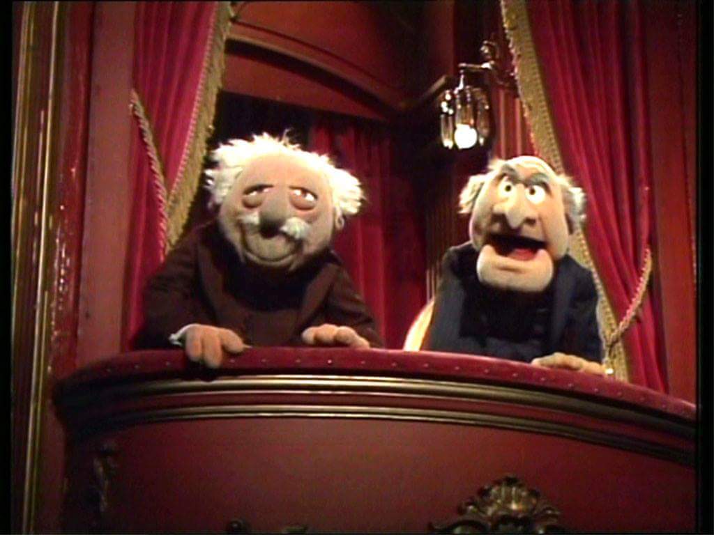
Could someone pls make an extended version of the Statler and Waldorf dialog from the Muppet balcony based on this graph? 🤔😁😂😉
Statler: Well, it was good.
Waldorf: Ah, it was very bad.
Statler: Well, it was average.
Waldorf: Ah, it was in the middle there.
Statler: Ah, it wasn't that great.
Waldorf: I kind of liked it."

