this post was submitted on 08 Jun 2024
928 points (99.2% liked)
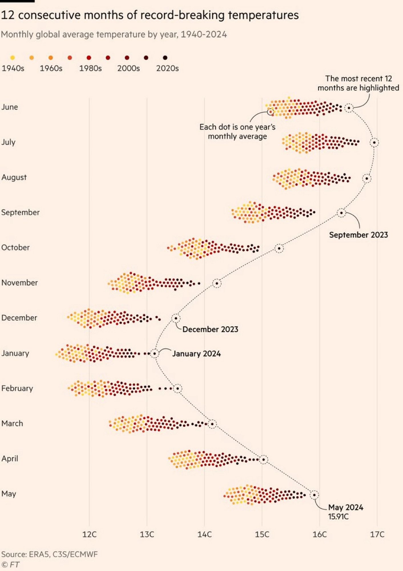
Data Is Beautiful
6462 readers
1 users here now
A place to share and discuss data visualizations. #dataviz
(under new moderation as of 2024-01, please let me know if there are any changes you want to see!)
founded 3 years ago
MODERATORS
you are viewing a single comment's thread
view the rest of the comments
view the rest of the comments
Quite the contrary. I have a red-green deficiency (and so do about 6% of men). Viridis Color scale is pretty nice but two much colors are hard to read for a lot of people
We need to invent an image format that let's chart colorw be tweaked after the fact lol
Actually, that's a feature that was common going all the way back to the very earliest image file formats: https://en.wikipedia.org/wiki/Indexed_color
It'd be easy enough to make the chart a plain old GIF or indexed PNG; the only non-trivial part is that you'd need add some code to the page it's embedded in to swap out the color palette. (You could also make it an SVG and manipulate it even more easily using the DOM.)
Well, the image format is based on indexed color for compression purposes ... But it's not like it calls out "these indexes should be customizable".